Before
SweeTarts Club Programs
After
The display team and packaging graphics team operated as separate functional teams our division. This arrangement resulted in carton design that was not optimized for sale at Club. The packaging graphics team operated separately from the display team. As a result mono-brand cartons sold at club didn’t have any consideration for how they would merchandise when packed into a club DU.
Fortunately, there was an opportunity to fix this situation when the time came to update the branding on the lid of these cartons.
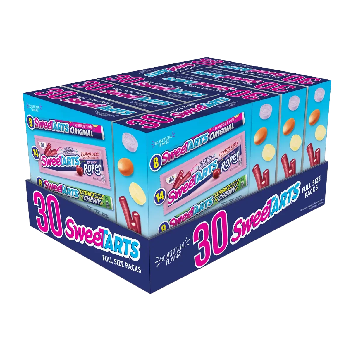
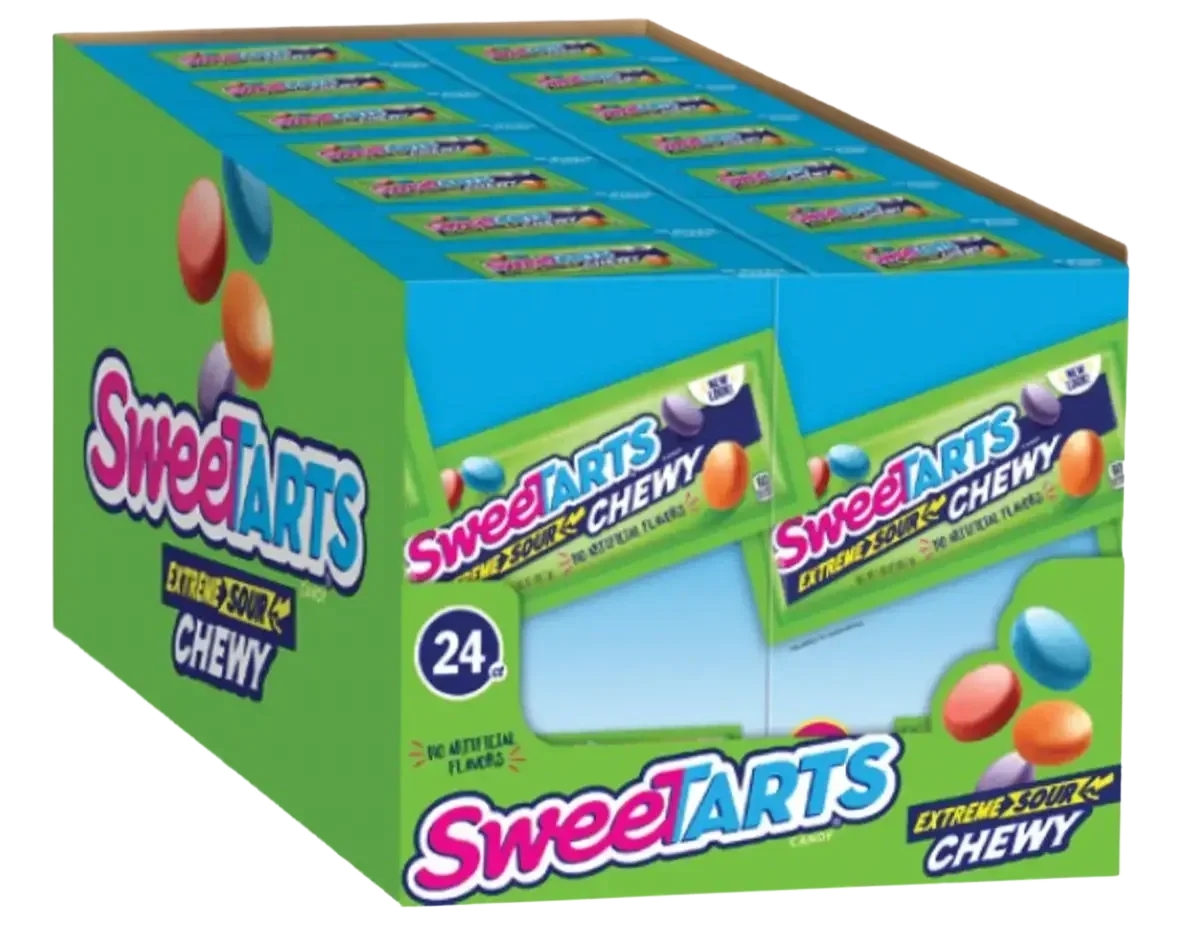
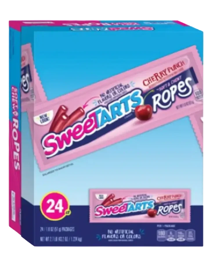
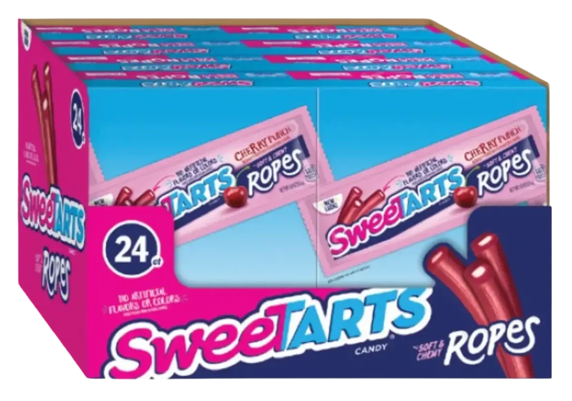
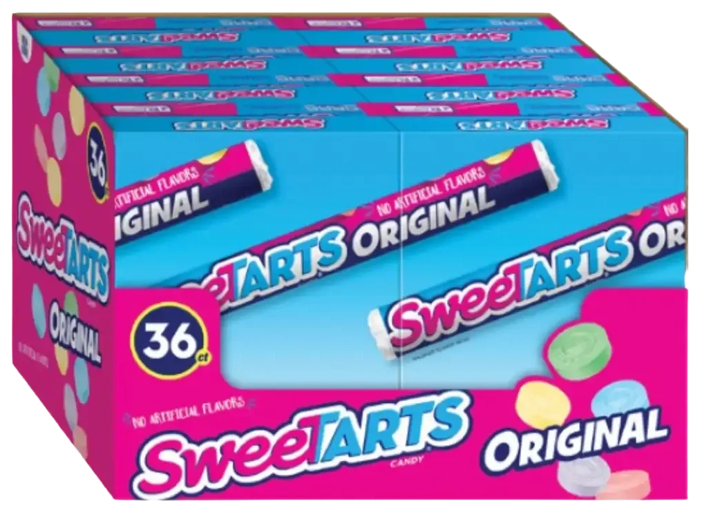
I considered the consumer unit and its display tray as if they were one graphic panel. I used the club tray to create a strong 1st read for the SweeTarts branding. The second read was of the product type and designed the visible are of the carton so that it would billboard when packed into its tray.
Big Ideas, Real Impact

Rooted in purpose, shaped by vision, driven by results. Welcome to a space designed for ideas that move people. With a focus on quality, clarity, and connection, we're here to help you make an impact that lasts.
Graphics for this SweeTarts 30ct variety pack had the following communication requirements - shown in order of priority:
SweeTarts branding
Total count of product within each carton
Pack shots of each item
Count for each pack within each carton
Product types - rope & pressed powder
I was able to meet all the requirements by designing both front and side panels of the carton and display tray as one graphic unit. Through this approach I used:
The club tray (DU) to call out the total count of product and the SweeTarts Branding as a strong 1st read.
Visible are of the front to communicate packs and their respective counts.
Visible are of carton’s side panel to communicate product type - chewy and pressed powder.